
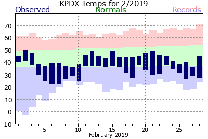
The center green band of these NOAA charts delimits the 20 year average for each day, the bottom marking the average minimum temp and the top marking the average high temp. The red and blue portions of the chart mark the range of temps between that and their record high and low levels. The dark blue ‘bars’ show the actual recorded temps for those days. This chart shows distinctly the initial cold span with the slight warming to well within normal range, followed by a more irregular cooling. The relative steadiness of these temperatures helped plants maintain their slower, more dormant metabolisms for the month. Typically February has been notable for the stability of its daily temperatures, the relative narrowness of the ‘green, normal, band’ indicates this.
